Vorapix

毎週更新 · コピー自由

プロンプトライブラリ、
すべて出力例つきで

公開したクリエイター自身から集めた画像・動画プロンプトで、どのカードにも作例を出したツール名が入っています。コピーするか、そのままパネルに送って実行できます。

ライブラリに 478 件

GPT Image 2 MS Paint Drawing Prompt — AI image prompt sample
Low-quality disposable camera high school snapshot prompt — AI image prompt sample
Train Photography Game Simulation — AI image prompt sample
3×3 cinematic storyboard contact sheet from one input image — AI image prompt sample
Convert Image to Editable PowerPoint Slide Prompt — AI image prompt sample
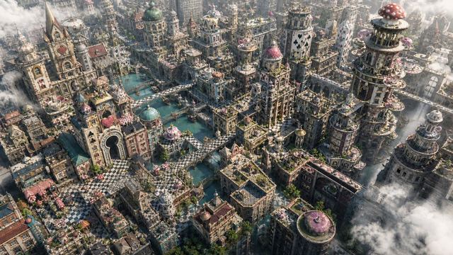
Fantasy Whimsical Downtown Aerial View — AI image prompt sample
Albedo Cosplay Instagram Story — AI image prompt sample
Software UI Desktop Screenshot — AI image prompt sample

コレクション別に見る

全 478 件。各コレクションが独立したページです。

GPT Image 2 MS Paint 風お絵描きプロンプト

Redraw the attached image in the most clumsy, scribbly, and utterly pathetic way possible. Use a white background, and make it look like it was drawn in MS Paint with a mouse. It should be vaguely similar but also not really, kind of matching but also off in a confusing, awkward way, with that low-quality pixel-by-pixel feel that really emphasizes how ridiculously bad it is. Actually, you know what, whatever, just draw it however you want.

CHOI

1 枚の入力画像から生成された 3×3 シネマティック ストーリーボード コンタクト シート

分析输入图像的整个构图。识别所有存在的关键主体(无论是单人、群体/情侣、车辆还是特定物体)及其空间关系/互动。 生成一个连贯的 3x3 网格“电影印样(Contact Sheet)”,展示在同一环境中完全是这些主体的 9 个不同镜头。 你必须调整标准的电影镜头类型以适应内容(例如,如果是群体,保持群体在一起;如果是物体,构图包含整个物体): 第 1 行(建立背景): 大远景 (ELS): 主体在广阔的环境中显得很小。 全景 (LS): 完整的主体或群体从上到下可见(从头到脚 / 从车轮到车顶)。 中远景 (美式镜头/四分之三): 构图从膝盖以上(针对人物)或 3/4 视角(针对物体)。 第 2 行(核心覆盖): 4. 中景 (MS): 构图从腰部以上(或物体的中心核心)。聚焦于互动/动作。 5. 中特写 (MCU): 构图从胸部以上。主要主体的亲密构图。 6. 特写 (CU): 紧凑构图于脸部或物体的“正面”。 第 3 行(细节与角度): 7. 大特写 (ECU): 强烈聚焦于关键特征(眼睛、手、标志、纹理)的微距细节。 8. 低角度镜头 (仰视/虫眼): 从地面仰望主体(壮观/英雄感)。 9. 高角度镜头 (俯视/鸟瞰): 从上方俯瞰主体。 确保严格的一致性:所有 9 个面板中是相同的人物/物体、相同的衣服和相同的光照。景深应逼真地变化(特写镜头中的背景虚化)。 一个包含 9 个面板的专业 3x3 电影故事板网格。 该网格以全面的焦距范围展示输入图像中的特定主体/场景。 顶行: 宽广环境镜头,全视图,3/4 剪辑(膝上景)。 中间行: 腰部以上视图,胸部以上视图,脸部/正面特写。 底行: 微距细节,低角度,高角度。 所有帧均具有照片般逼真的纹理,一致的电影级调色,以及针对所分析的主体或物体特定数量的正确构图。

松果先森

NEWT 日本向け旅行アプリ広告

Goal: Create a vibrant Japanese travel-app advertising poster for NEWT, combining editorial travel photography, clean app UI mockups, and bold Japanese typography to promote the feeling that the next trip is already beginning. Canvas: Square 1:1 promotional graphic, bright white and mint-green background, high-key summer lighting, energetic composition, polished commercial ad quality. Layout: A large diagonal Japanese headline dominates the top-left and upper center. The main traveler stands large in the center foreground, smiling and looking up to the right while holding a smartphone showing the green brand screen. A second traveler appears behind her on the left inside an airport scene. Layer multiple travel photo cutouts around the lower half and right side, with floating app interface cards over them. Place a large green rounded brand block on the upper-right. Text content: Use exactly 5 main text groups: 1) huge headline text 次の旅が、もう始まってる。 in vivid green, with the first line filled and the second line outlined; 2) small upper-right Japanese copy 航空券も、ホテルも、アプリひとつで軽やかに。; 3) English tagline “TRAVEL FEELS NEW.” near the top-right; 4) left-side vertical category list with exactly 5 items: “AIRPORT”, “HOTEL”, “CITY”, “BEACH”, “FOOD”; 5) brand block text with a white animal-like logo, the word “NEWT”, and the small Japanese call-to-action “NEWTで旅をみる” with a circular arrow icon. Subject details: Main subject is a cheerful young East Asian woman traveler, mid-20s, short dark bob hair moving naturally, gold hoop earrings, green ribbed top, loose translucent mint-and-white striped overshirt, cream high-waisted pants, woven straw shoulder bag with a small green charm, pulling a dark green rolling suitcase. She holds a phone with a green screen, white brand logo, and “NEWT” text. Secondary subject is a smiling young East Asian woman in an orange cardigan at an airport, holding a drink, with a departures board behind her. Travel image collage: Include exactly 5 travel photo cutouts: 1) bright airport terminal with departures board behind the secondary woman, 2) luxury hotel room with ocean view, 3) close-up seafood dish with shrimp and greens near the suitcase, 4) turquoise beach and ocean with swimmers on the right, 5) colorful resort city street with palm trees along the bottom-right. App UI cards: Include exactly 2 floating white app interface cards with rounded corners and soft shadows. Card 1 is a booking search card at mid-right with tabs for flight, hotel, and package; large destination text “ソウル”, small text “SEOUL, KOREA”, rows showing round trip, dates “6月20日(金) - 6月23日(月)”, passengers “大人1名、エコノミー”, and a green button labeled “検索する”. Card 2 is a hotel recommendation card lower-right with a pool thumbnail, small heart icon, hotel name “NEWT SEOUL 明洞”, rating “4.8”, and five yellow stars. Visual style: Premium Japanese startup travel campaign, fresh mint green brand color, crisp cutout collage, clean sans-serif typography, dynamic diagonal composition, airy negative space, glossy magazine-ad finish, realistic photography mixed with minimal vector UI. Add a dotted flight path with a location pin near the top-right. Constraints: Use no extra logos or watermarks beyond the specified brand. Keep all Japanese text legible and accurately placed. Maintain the strong green-and-white identity, optimistic summer travel mood, and layered depth.

Takaya Shinozuka / CEO of Reiwa Travel

カナダ市民権カードのモックアップ

Ultra-realistic 16:9 close-up scan of a Canadian citizenship card placed on a clean light grey/white background. The card is horizontally aligned, centered in frame, captured in sharp focus with studio lighting. Design features a modern government-issued ID layout with bilingual English and French text. Top-left includes the Canadian flag with a red maple leaf. Header text reads “CANADA – CANADIAN CITIZENSHIP CARD / CARTE DE CITOYENNETÉ CANADIENNE.” The card includes a passport-style portrait of a young woman: medium-length dark brown hair, center-parted, natural makeup, warm skin tone, neutral expression, direct gaze, subtle freckles, wearing minimal jewelry and a dark top. Personal details section includes: – Surname: MARTIN – Given names: ÉMILIE SOPHIE – Citizenship number: 1234-5678 – Date of birth: 14 APR 1996 – Place of birth: MONTRÉAL, QC, CANADA – Issue date: 20 MAY 2024 – Expiry date: 20 MAY 2034 Background design includes intricate guilloche patterns, microprinting, and soft pastel gradients. A large holographic maple leaf occupies the right side with iridescent rainbow reflections. Additional elements: – Government of Canada emblem in top-right – Embedded hologram square with maple leaf security seal – Fine-line engraving patterns across the surface – Signature at bottom right (“Émilie S. Martin”) Lighting is soft and even, highlighting laminated plastic texture, subtle reflections, and security overlays. No hand visible. Clean, minimal, professional composition. Photorealistic, high detail, 8K quality.

ANKIT PATEL 🇮🇳 | AI

フォトリアルなデュアルジムミラーセルフィープロンプト

{ "prompt_type": "photorealistic gym mirror selfie", "main_composition": "mirror selfie of two athletic young women standing side by side with backs to the camera in a dimly lit modern gym, confidently posing with hands on hips and slight arch to emphasize curves, full reflections visible in large mirror showing their front sides and subtle expressions, vibrant colorful workout outfits contrasting moody blue/purple ambient lighting, professional fitness studio with equipment blurred in background", "subject_1_left": { "description": "beautiful young woman in her early 20s, fit curvy athletic build with toned glutes and legs, long wavy light brown or blonde pigtails hair styled in high ponytail with loose strands, fair tanned smooth skin with healthy glow", "clothing": "bright pink long-sleeve crop top with thumb holes and subtle sheen, matching high-waisted seamless short scrunch-butt pink leggings with 'DFYNE' logo on waistband, white athletic socks", "details": "confident pose with hand on hip and slight smile visible in mirror reflection, hair naturally tousled, relaxed athletic stance" }, "subject_2_right": { "description": "beautiful young woman in her early 20s, fit curvy athletic build with toned glutes and legs, long wavy darker brown hair in loose ponytail or braids, fair tanned smooth skin with healthy glow", "clothing": "light yellow halter-style sports bra with thin straps, matching high-waisted seamless short scrunch-butt pink leggings, white athletic socks", "details": "playful confident pose with hand on hip and subtle expression in mirror reflection, hair with natural volume" }, "environment": { "foreground": "dark rubberized gym floor with subtle texture", "midground": "large wall mirror reflecting both women fully and gym interior", "background": "modern gym with dim blue/purple ambient lighting, blurred cardio machines and weight equipment, exposed ceiling ducts and pipes, clean spacious professional fitness center atmosphere" }, "lighting_and_atmosphere": "dim moody indoor gym lighting with cool blue/purple neon accents and overhead spots, subtle highlights on skin, hair, and shiny leggings fabric creating vibrant color pops, energetic confident workout vibe with high contrast between bright outfits and dark surroundings, photorealistic detail", "technical_quality": "highly detailed, sharp focus on subjects with realistic seamless fabric textures (scrunch-butt shine, crop top stretch), skin glow, hair movement, and mirror reflections, 8k resolution, professional mirror selfie photography style with slight wide-angle lens effect and natural depth of field softly blurring background equipment", "negative_prompt_suggestions": "blurry, deformed, extra limbs, phone screen visible, mirror distortion or misalignment, overexposed neon lights, underexposed faces, low quality, cartoon, anime, text watermark, extra pe"

KeorUnreal

3つの軸から探せるプロンプトライブラリ

使えそうなものが見つかるまでスクロールし続ける長文の壁ではありません。すべてのプロンプトは「何のためのものか」「見た目はどうか」「画面に何が写っているか」という3つの軸に同時に分類されているので、「レトロ調の縦型フード写真」のような要望も1、2クリックで見つかります。用途は、画像側では商品撮影・ポスターデザイン・SNS用サムネイル、動画側ではシネマティックなシーケンス・Vlog・短編・CMをカバーします。スタイルはフォトリアルからアニメ、3D、ストップモーション、ヴィンテージまで幅広く、被写体は実際に画面に写っているもの——人物、商品、フード、建築、動物、文字——で分類しています。この3軸に加えて、ライブラリはモデルファミリー——Nano Banana、GPT Image、Seedance——別にもグループ化され、画像と動画も分かれているので、やりたいことからではなく、結果を見たツールから探し始めることもできます。コレクション全体のおよそ3分の2が画像で、残りが動画です。どのカードもそのブリーフが生んだ出力例を表示し、公開した人物をクレジット表記しています。この ai プロンプトライブラリのどの項目も、ここで実行するかどうかにかかわらず無料でコピーできます。

このライブラリについてのよくある質問

並べ方、出どころ、閲覧にかかる費用について。

このプロンプトライブラリはどう整理されていますか?

3つの軸と2つのグループ分けです。用途・スタイル・被写体はそれぞれ独自のコレクションページを持ち、そのうえですべてがモデルファミリー別にグループ化され、画像と動画にも分かれます。1件のプロンプトが同時に複数のグループへ属することも多いので、たどり着く経路は1つとは限りません。

これらのプロンプトはどこから来ていますか?

そのほとんどは公開された投稿から収集し、一言一句そのまま掲載したうえで、書いた本人へのリンクを添えています。言い回しそのものが効いている部分なので、言い換えたり整えたりはしません。社内で書いた項目についてはカードにその旨を明記し、実行にかかったコストも記載しています。

サンプルの画像やクリップは Vorapix が作っていますか?

いいえ。どのカードのバッジも、それを曖昧にしないために存在します——クリエイターが使ったサードパーティのツール名が書かれています。Vorapix が提供しているのは「そのまま生成」ボタンの先にあるスタジオで、必ずしも同じモデルとは限りません。サンプルは「この言い回しが効く」という証拠として見るものであり、あなた自身の出力のプレビューではありません。

閲覧にアカウントは必要ですか?

いいえ。閲覧・絞り込み・コピーは誰でも利用できます——プロンプトは無料、サインイン不要、コピー回数の上限もありません。アカウントが必要になるのは生成するときだけです。生成にはクレジットを使うためです。登録には無料クレジット10クレジットが含まれるので、決める前にいくつか試せます。

新しいプロンプトはどのくらいの頻度で追加されますか?

毎週、まとめて追加されます。サンプル、出典リンク、ツールバッジのすべてが確認できて初めて1件が公開されるので、件数は連続的にではなく段階的に増えていきます。コミュニティが最も活発なファミリーほど、追加ごとの伸びが大きくなる傾向があります。

関連コレクション

Vorapix

閲覧も無料、コピーも無料。